UI Layout
Let’s make a simple layout for the chat app first.
Open App.js, delete everything from the template, and update it to this:
import "./App.css";

function App() {
  return (
    <div className="app">
      <h1 className="app-name">Literank Web Chat</h1>
      <div className="segments">
        <span className="segment left-seg picked">Chat</span>
        <span className="segment right-seg">Groups</span>
      </div>
      <div className="card">
        <div className="contacts"></div>
        <div className="main">
          <div className="messages"></div>
          <div className="edit">
            <textarea className="edit-box" placeholder="Type here" />
            <div className="buttons">
              <button className="send-btn">Send</button>
              <span className="tip">Ctrl+Enter to send</span>
            </div>
          </div>
        </div>
      </div>
      <div className="status">
        <span className="dot connected"></span>
        <span>Connected</span>
      </div>
    </div>
  );
}

export default App;
Open App.css, delete everything from the template, and update it to this:
:root {
  --bg-color: #008170;
  --text-color: #ffffff;
  --theme-color: #005b41;
  --secondary-color: #232d3f;
}

body {
  background-color: var(--bg-color);
  font-family: Geneva, Verdana, Tahoma, sans-serif;
}

.app {
  margin: 5vh auto;
  width: 60rem;
  text-align: center;
  color: var(--text-color);
}

.app-name {
  text-align: left;
}

.segments {
  margin-top: 1rem;
}

.segment {
  background-color: var(--secondary-color);
  padding: 5px 12px;
  cursor: pointer;
}

.left-seg {
  border-top-left-radius: 0.5rem;
  border-bottom-left-radius: 0.5rem;
}

.right-seg {
  border-top-right-radius: 0.5rem;
  border-bottom-right-radius: 0.5rem;
}

.status {
  display: flex;
  justify-content: flex-end;
  align-items: center;
}

.picked {
  background-color: var(--theme-color);
}

.card {
  box-sizing: border-box;
  background-color: rgba(255, 255, 255, 0.2);
  margin: 1rem 0;
  border-radius: 0.5rem;
  display: flex;
}

.contacts {
  flex: 1;
}

.main {
  flex: 3;
  height: 60vh;
  background-color: whitesmoke;
  border-top-right-radius: 0.5rem;
  border-bottom-right-radius: 0.5rem;
  display: flex;
  flex-direction: column;
}

.main .messages {
  flex: 6;
}

.main .edit {
  border-top: solid 1px rgba(255, 255, 255, 0.5);
  flex: 1;
  display: flex;
}

.edit .edit-box {
  font-size: large;
  padding: 5px;
  border: none;
  flex: 5;
  resize: none;
}

.edit-box:focus {
  outline: solid 1px var(--theme-color);
}

.edit .buttons {
  flex: 1;
  display: flex;
  align-items: center;
  justify-content: space-evenly;
  flex-direction: column;
}

.tip {
  font-size: 10px;
  color: gray;
}

.send-btn {
  padding: 6px 20px;
  font-size: 20px;
  background-color: white;
  border: none;
  border-bottom: solid 5px var(--theme-color);
  border-radius: 0.5rem;
  cursor: pointer;
  color: var(--theme-color);
}

.dot {
  width: 10px;
  height: 10px;
  border-radius: 5px;
  background-color: white;
  margin-right: 5px;
}

.connected {
  background-color: lime;
}
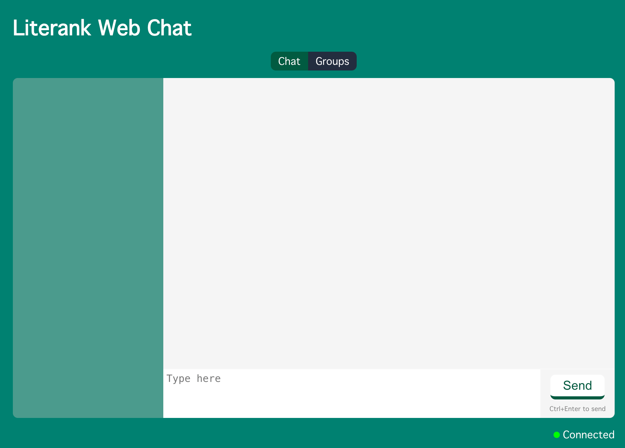
The dev server will automatically refresh the page, and you should be able to see something like this.
Message Bubbles
Add a component src/components/message.jsx:
import React from "react";
import "./Message.css";
import clsx from "clsx";

const Message = (props) => {
  return (
    <div className={clsx("wrapper", { "self-side": props.isSelf })}>
      <div className="message">
        <div className="meta">{props.username}</div>
        <div className="bubble">{props.message}</div>
      </div>
    </div>
  );
};

export default Message;
clsx is a tiny utility for constructing className strings conditionally.
Use npm to install it.
npm i clsx
Add its style file src/components/Message.css:
@import url(../vars.css);

.wrapper {
  display: flex;
  justify-content: flex-start;
}

.message {
  width: max-content;
}

.self-side {
  justify-content: flex-end;

  .bubble {
    background-color: var(--theme-color);
  }

  .meta {
    text-align: right;
    padding-right: 0.4em;
  }
}

.meta {
  color: darkgray;
  text-align: left;
  padding-left: 0.4em;
}

.bubble {
  background-color: var(--bg-color);
  padding: 0.6em;
  border-radius: 0.8em;
}
To share css variables among multiple files, create src/vars.css:
:root {
  --bg-color: #008170;
  --text-color: #ffffff;
  --theme-color: #005b41;
  --secondary-color: #232d3f;
}
Update src/App.css:
@@ -1,9 +1,4 @@
-:root {
-  --bg-color: #008170;
-  --text-color: #ffffff;
-  --theme-color: #005b41;
-  --secondary-color: #232d3f;
-}
+@import url(vars.css);

 body {
   background-color: var(--bg-color);
@@ -75,6 +70,7 @@ body {

 .main .messages {
   flex: 6;
+  padding: 10px;
 }

 .main .edit {
Put in test messages in src/App.js:
@@ -1,6 +1,25 @@
 import "./App.css";
+import Message from "./components/message";

 function App() {
+  const messages = [
+    {
+      username: "Alice",
+      message: "Hello there",
+    },
+    {
+      username: "Bob",
+      message: "How's everything?",
+    },
+    {
+      username: "Alice",
+      message: "Great! Wanna have a drink?",
+    },
+    {
+      username: "Bob",
+      message: "Sure",
+    },
+  ];
   return (
     <div className="app">
       <h1 className="app-name">Literank Web Chat</h1>
@@ -11,7 +30,15 @@ function App() {
       <div className="card">
         <div className="contacts"></div>
         <div className="main">
-          <div className="messages"></div>
+          <div className="messages">
+            {messages.map((e) => (
+              <Message
+                username={e.username}
+                message={e.message}
+                isSelf={e.username === "Bob"}
+              />
+            ))}
+          </div>
           <div className="edit">
             <textarea className="edit-box" placeholder="Type here" />
             <div className="buttons">
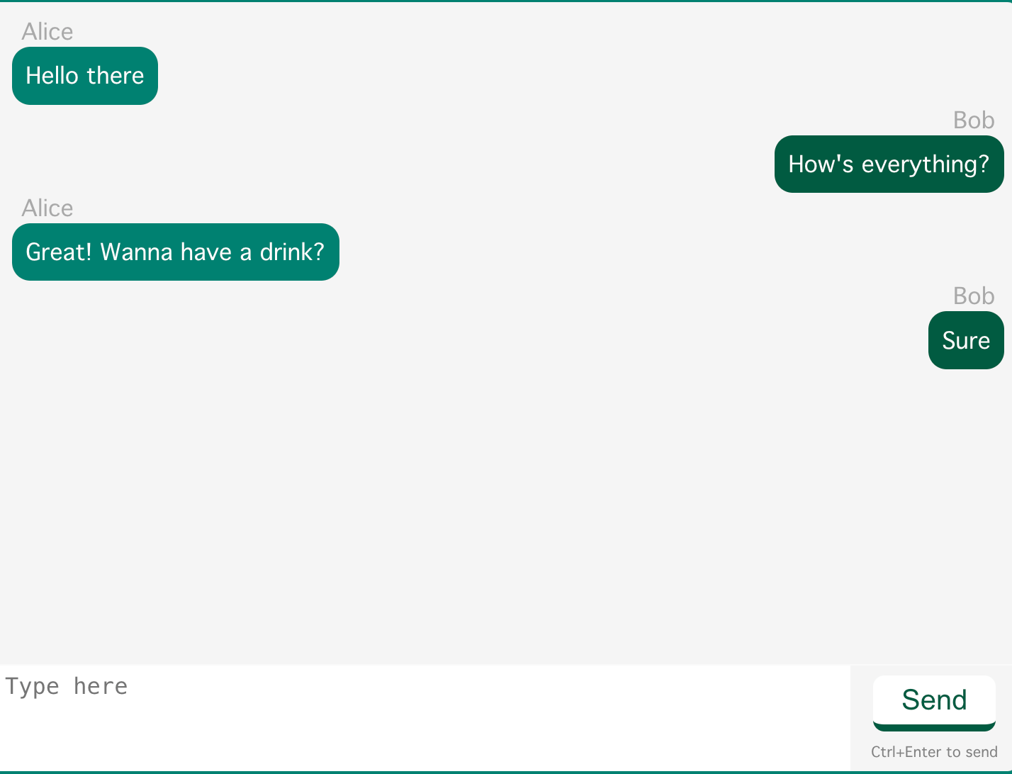
Your test messages should look like this:
Contact List
Add src/components/contact.jsx:
import React from "react";
import "./Contact.css";
import clsx from "clsx";

const Contact = (props) => {
  return (
    <div className={clsx("contact", { offline: props.isOffline })}>
      <div className="name truncate">{props.username}</div>
      <div className="last-message truncate">{props.message}</div>
    </div>
  );
};

export default Contact;
Add src/components/Contact.css:
@import url(../vars.css);

.contact {
  padding: 6px 10px;
  border-bottom: solid 1px var(--theme-color);
  text-align: left;
}

.name {
  font-weight: bold;
  font-size: larger;
  max-width: 7em;
}

.last-message {
  color: lightblue;
  font-size: x-small;
  max-width: 14em;
}

.offline {
  color: var(--secondary-color);
}

.truncate {
  white-space: nowrap;
  overflow: hidden;
  text-overflow: ellipsis;
}
Tune src/App.js:
@@ -1,4 +1,5 @@
 import "./App.css";
+import Contact from "./components/contact";
 import Message from "./components/message";

 function App() {
@@ -20,6 +21,24 @@ function App() {
       message: "Sure",
     },
   ];
+  const contacts = [
+    {
+      username: "🦁 Alice",
+      message: "Sure",
+    },
+    {
+      username: "♣ Cindy",
+      message: "Where r u",
+    },
+    {
+      username: "🐯 Doug Smith",
+      message: "Hi",
+    },
+    {
+      username: "🐴 Emily",
+      message: "How's your assignment? I didn't do much yesterday",
+    },
+  ];
   return (
     <div className="app">
       <h1 className="app-name">Literank Web Chat</h1>
@@ -28,7 +47,15 @@ function App() {
         <span className="segment right-seg">Groups</span>
       </div>
       <div className="card">
-        <div className="contacts"></div>
+        <div className="contacts">
+          {contacts.map((e) => (
+            <Contact
+              username={e.username}
+              message={e.message}
+              isOffline={e.username.includes("Emily")}
+            />
+          ))}
+        </div>
         <div className="main">
           <div className="messages">
             {messages.map((e) => (
@@ -49,8 +76,11 @@ function App() {
         </div>
       </div>
       <div className="status">
-        <span className="dot connected"></span>
-        <span>Connected</span>
+        <span>🐱 Bob</span>
+        <div className="connection-status">
+          <span className="dot connected"></span>
+          <span>Connected</span>
+        </div>
       </div>
     </div>
   );
Tune src/App.css:
@@ -7,7 +7,7 @@ body {

 .app {
   margin: 5vh auto;
-  width: 60rem;
+  width: 52rem;
   text-align: center;
   color: var(--text-color);
 }
@@ -38,7 +38,7 @@ body {

 .status {
   display: flex;
-  justify-content: flex-end;
+  justify-content: space-between;
   align-items: center;
 }

@@ -59,7 +59,7 @@ body {
 }

 .main {
-  flex: 3;
+  flex: 4;
   height: 60vh;
   background-color: whitesmoke;
   border-top-right-radius: 0.5rem;
@@ -115,6 +115,11 @@ body {
   color: var(--theme-color);
 }

+.connection-status {
+  display: flex;
+  align-items: center;
+}
+
 .dot {
   width: 10px;
   height: 10px;
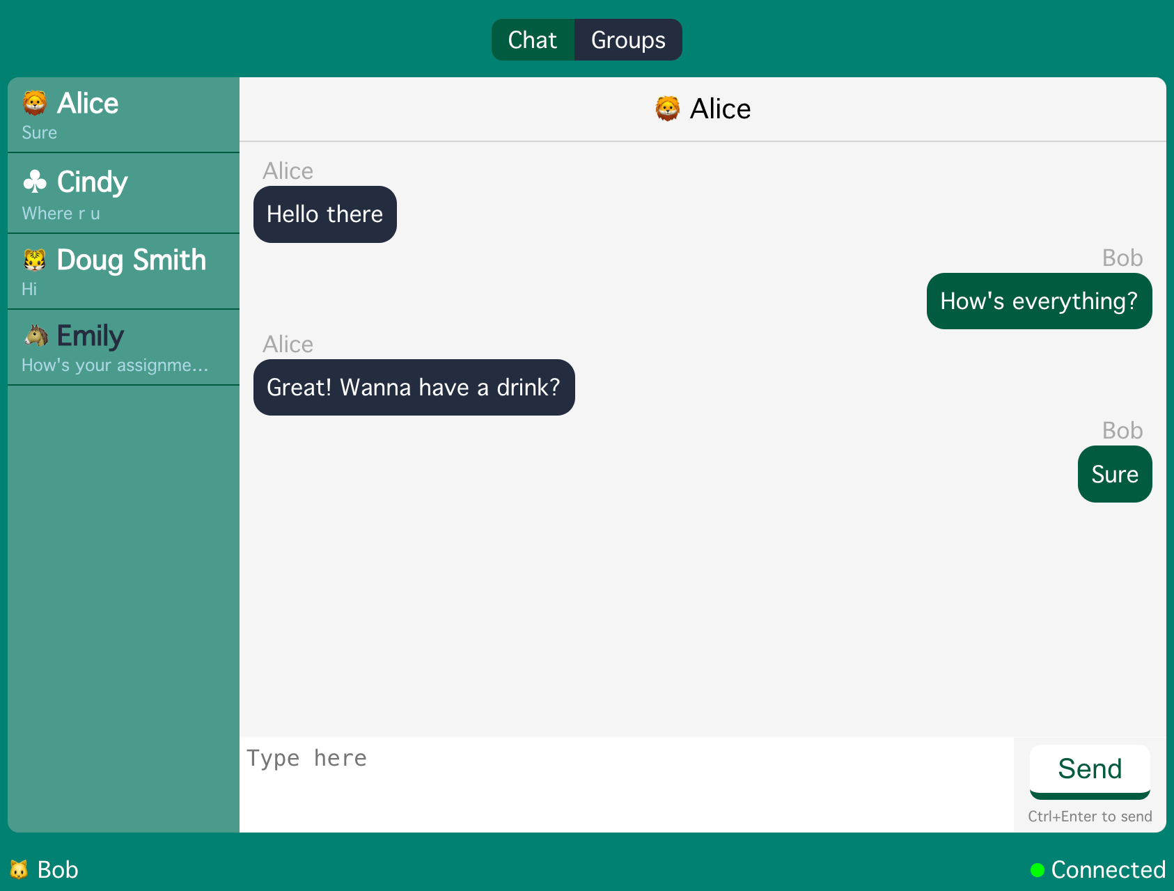
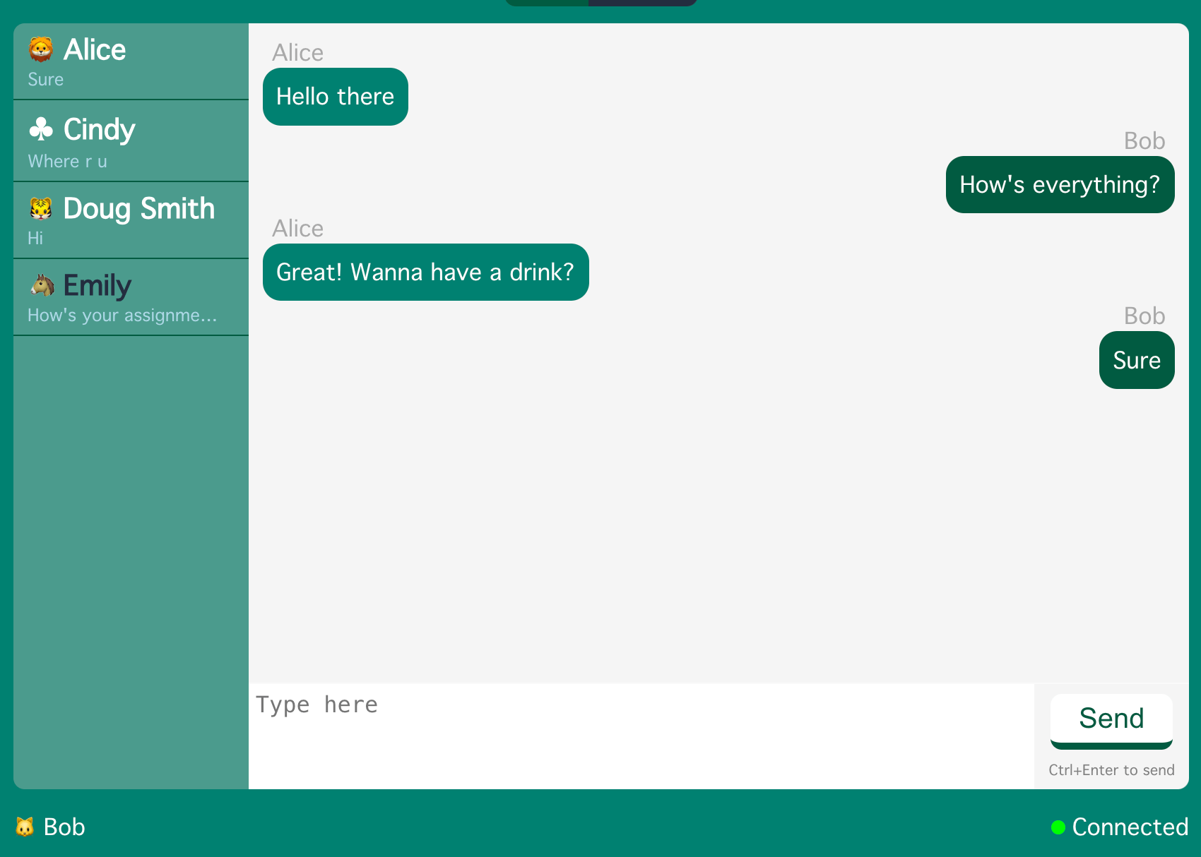
Your contact list should be something like this:
Title Bar
Add src/components/ttile-bar.jsx:
import React from "react";
import "./TitleBar.css";

const TitleBar = (props) => {
  return <div className="title">{props.username}</div>;
};

export default TitleBar;
Add src/components/TitleBar.css:
.title {
  font-size: larger;
  color: black;
  padding: 10px;
  border-bottom: solid 1px lightgray;
}
Tune src/App.js:
@@ -1,6 +1,7 @@
 import "./App.css";
 import Contact from "./components/contact";
 import Message from "./components/message";
+import TitleBar from "./components/ttile-bar";

 function App() {
   const messages = [
@@ -57,6 +58,7 @@ function App() {
           ))}
         </div>
         <div className="main">
+          <TitleBar username={contacts[0].username} />
           <div className="messages">
             {messages.map((e) => (
               <Message
Tune message bubble background color in src/components/Message.css:
@@ -29,7 +29,7 @@
 }

 .bubble {
-  background-color: var(--bg-color);
+  background-color: var(--secondary-color);
   padding: 0.6em;
   border-radius: 0.8em;
 }
It looks like this: